Sophie Morgan, a supporting character in Between Worlds, is twelve and has juvenile macular degeneration. Aside from attempting to improve accessibility for my readers in general, it also seemed appropriate to offer the novels as large print books because of Sophie. However, trying to learn what the norm for large print edition books actually is proved more difficult than I had thought.
Large Print, Small Selection
When I checked a major book store’s large print books section, I mistakenly thought all the packaged series books were the large print ones. Although there was no other indication on the packaging that these books were large print, they were on the shelf that had “large print” and “audio” on its label. (“Series” must have been there, too, but I probably developed tunnel vision once I saw “large print.”)
I wanted to see what large print looked like so I could produce it for my readers. However, with all these “large print” books wrapped in plastic, I couldn’t look inside. So, I went home.
Best Practices for Large Print Books

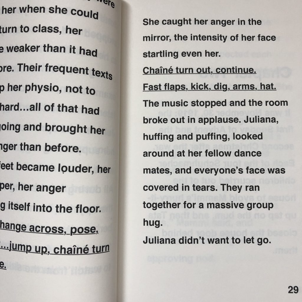
Online, I found the American Council of the Blinds’ best practices for developing large print materials. I read through them and did the best I could to reproduce them in book format:
- 19-point sans serif bold font
- 1.5 line spacing
- left alignment for all text
- no italics
- asterisks to denote indented passages, like letters and Bible excerpts (necessary for the historical time line).
I’m certain some areas could use improvement, but the document said that the most important factors in creating large print books for the low-vision community were spacing, font size, contrast, and font style, and in that order. I think I got those okay.

Ensuring Large Print Editions Are Readable
It’s impossible to approximate with my own eyes how someone with low vision sees. I can blur my vision, but that’s not the same thing. Thankfully, an acquaintance of mine out West, Kyle Bergum, volunteers as an advocate for the Canadian National Institute for the Blind. He agreed to evaluate the first large print copy of The Move.
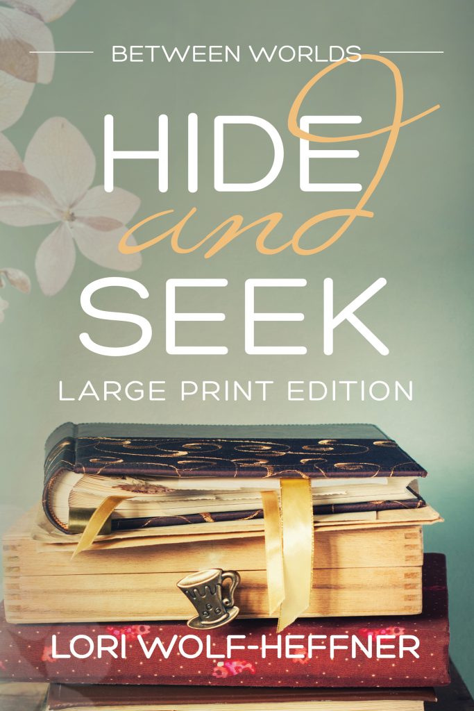
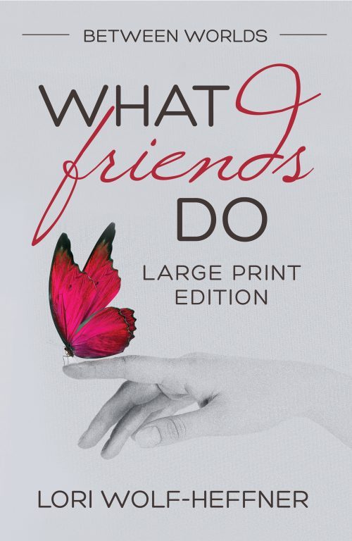
How Kyle found time in between his career as a senior IT leader, work as an opera singer and voice over artist, and his volunteer role, I’ll never know. But somehow he did. When the first book got his blessing, I went ahead with The Distance and The First Step. As of February 2020, all five books are now available as large print editions, and all future instalments in Between Worlds will be available in large print.
Ordering Between Worlds in Large Print
Unfortunately, you likely won’t find any of these on bookstore shelves. But they are available on Amazon, Indigo, and Barnes & Noble websites. In addition, independent bookstores should be able to order them in for you.
That Was a Large Print Book?
A few weeks after that first visit, I finally woke up and noticed that the large print section was indeed where I was looking, except it took up a shelf-and-a-half further up. (I wondered how someone with low vision would ever find those—I’m 5’9” and had to look up.) When I finally opened one up, I was shocked: The font looked barely larger than that found in a child’s chapter book and it didn’t follow most of the ACB guidelines I’d read about and tried to follow. In fact, it looked more like a relaxing read for me, and I can read really tiny print.
So, there you have it. Between Worlds is available not only in ebooks and regular print formats, but also in large print that follows the guidelines of the American Council for the Blind. Search for “Lori Wolf-Heffner” at your favourite online book retailer, and you should be able to find the large print books in the list of Between Worlds books.
This blog post was updated February 16, 2020, July 13, 2020, and on March 30, 2021.


